
A Masterclass In Wine Labels
A wine label has only 1.5 seconds to make an impact, according to Real Picture Research, so it should jump out from a seemingly endless number of bottles. Here, three local design agencies provide their expert opinion on what makes a great label, with the help of some of their favorites.
“Whether it’s sold in store, by the glass or bottle at a restaurant or offered in a tasting room will greatly affect the look of a wine label. In-store you want the label to stand out from a sea of labels all placed on similar looking bottles. The label is everything! It must be iconic, memorable and catch the consumer’s eye at a quick glance. When a wine label is sold in a restaurant, the drinker is typically buying from a list, so they’re basing their decision on a server’s opinion and recommendations, or the varietal or name of the wine on the list. In this case, the label isn’t quite as important in grabbing the consumer’s eye, but once the server brings it to the table, you want the buyer to be excited and feel justified in their decisions. An ugly, outdated or questionable label will quickly have someone second guessing their decision when the wine arrives.
If a winery is planning to sell their wine directly from their tasting room or their online store, this is where they have the most creative freedom. In these cases the wine is typically hand sold or is accompanied by tasting notes or a narrative on the wine itself and its inspiration or journey from vineyard to bottle.
A winery can have a lot of fun when a label is sold solely in a tasting room or on the website; it doesn’t need to fight for brand presence on the label. In these scenarios the winery owners or winemaker has the option to throw on a portrait of grandpa and pay homage to his legacy, or use a daughter’s artwork or hand-draw something.
Stories is really where inspiration is pulled for the labels. Without a label, every wine in a bottle inherently looks the same, but the story is the catalyst for the label. Whether it’s an authentic story that speaks to the soul of the vineyard and the winemaking, or a fanciful story to get the buyer pumped up for a steak dinner or a girls’ night, this is what helps form a connection with the drinker and the wine.
At the end of the day, a label is selling to people, so it must know which people it’s being sold to. This takes a little bit of research, investigation and simple understanding of the market and demographic. Understanding where the wine will be sold, what one wants to communicate and who is being communicated to will greatly help navigate the endless options of a wine label.”
—Sarah Melissa Deiter, Co-Founder and Creative Director, Makers & Allies in San Luis Obispo
“The visual of the label is a big deal; it can make it or break it for the brand. There are a lot of little nuances that make a good label great, with so many options as far as paper choices, finishing touches and embellishments. And the label needs to work for the desired audience, not the owner of the winery, marketing director or creative director. A key to a successful brand and label creation is that it works for the target audience. At the end of the day it does not matter if I or the client likes it; it must work for the potential customer.
Interestingly enough, trends change more rapidly these days — it’s such a fast-paced environment nowadays, unlike 10–15 years ago when trends stuck around for a couple of years and switched directions a lot more slowly (remember ‘critter labels?’). Social media is a huge factor now, with content going viral and brands jumping on that bandwagon. One trend lately is more fun and unconventional labels, labels that say, ‘this wine is to be consumed now.’ They’re also a bit more into new containers, like canned wines and boxed wines.”
—Thomas Reiss, Creative Director and Founder, Kraftwerk Design Inc. in San Luis Obispo
“A winery has a lot to consider when creating a label, from the initial vision for the label, to the type of label stock, embellishments and colors, down to the placement of the label on the glass or the glass itself. The original vision for the label and the message the winery wants that particular label to convey is probably the most important aspect as this will drive what happens during the rest of the process. Also, as much as it can cause the reins to be pulled back a bit on the vision and plan for the finished project, the budget is a huge part of any project. Having a solid plan for the message a winery wants to convey and a solid idea of the budget really helps the actual design process get off to a good start.
The more a winery has thought about what type of message or story it wants the label to convey, then the more the detail can lead to a better final label matching the original vision with a meaningful design.
A winery should also take into consideration how a particular label will interact with other labels. Should it complement previous and/or current labels for its other wines, or should it be unique? Too many unique labels can make it hard to recognize a brand when seeing it on a shelf. At the same time, a unique label every once in a while in relation to other labels within the brand can create a sense of specialness and even exclusivity for that particular wine.
A few trends we’ve noticed over the last year or so are the use of medallions with a combination of screen printing, and the use of heavy texture on a label — such as sculpted, emboss, deboss, etc. — to encourage the touching of the label, and pushing the envelope in the use of the packaging as the label, such as cans, boxes, bags and tins.”
—Nolan Henderson, Designer and Creative Director at Clever Concepts in Paso Robles
- “One trend lately is for more fun and unconventional labels, labels that say this wine is to be consumed now.” —Thomas Reiss
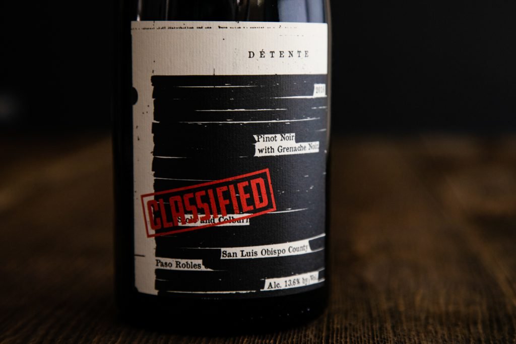
- “We draw inspiration from the 1970s military propaganda era art, double agents and classified government documents to give labels their unique talking points. We went in this creative direction initially because Détente was just getting off the ground and there was a bit of a mystery to who we were. We felt like a top-secret classified mission.” —Julian Caustrita, Creative Lead and Co-Owner, Détente Wines in Paso Robles
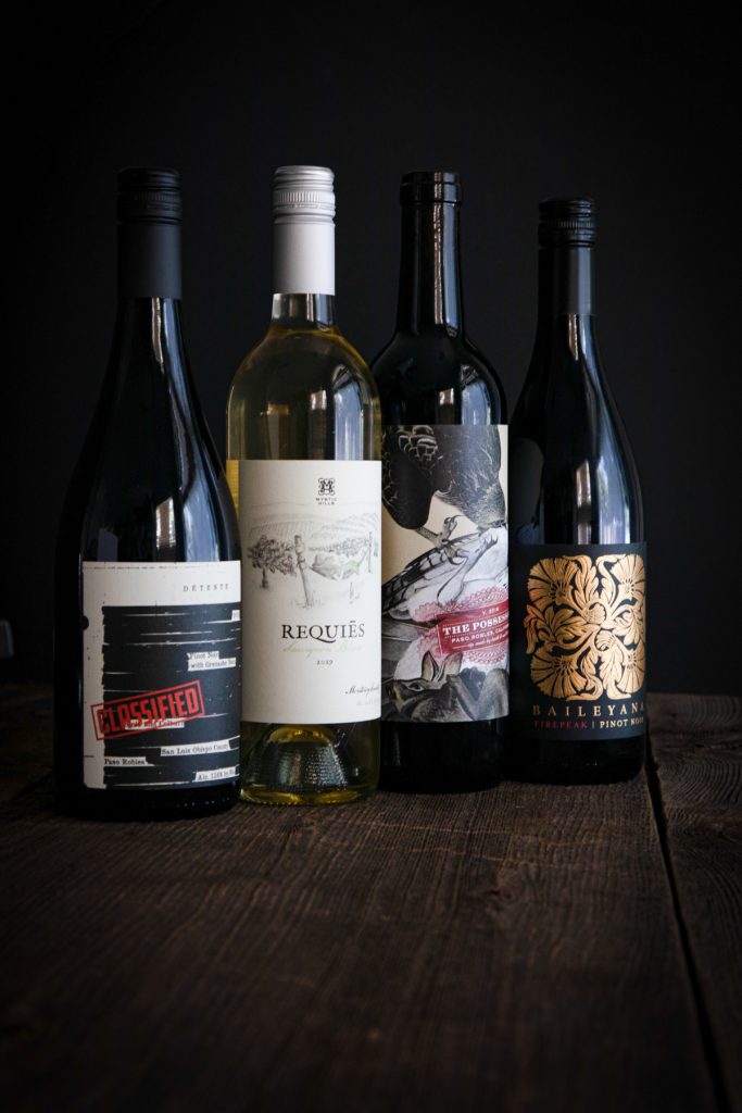
- The label is a cropped quadrant of a classified document. The document appears scanned, offset with redacted text and bears a large “CLASSIFIED” stamping. It’s meant to feel purposeful with a tactile pinstripe-embossed finish resembling handcrafted paper from several decades ago.
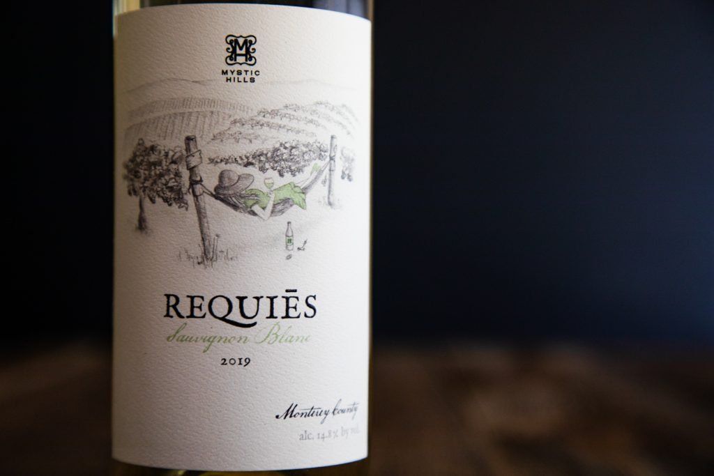
- “One of our favorite bottles to date. The hand-drawn label captures the winery’s vision, conveying a sense of relaxation and rest from labor.” —Nolan Henderson
- A more traditional wine label is designed in such a way that it shows the whole process of the wine at first sight, highlighting its origin, different ingredients or components of the wine, alcohol content, year. These mentioned features are unique selling points of the product to be introduced in the market.
- Among such stiff competition to make a wine bottle stand out, you need a distinctive wine label design that grabs the attention of customers.
- “A trend we’ve noticed over the last year or so is the use of heavy texture on a label, such as sculpted emboss or deboss — two techniques used to either impress or depress an image into paper — to encourage the touching of the label.” —Nolan Henderson
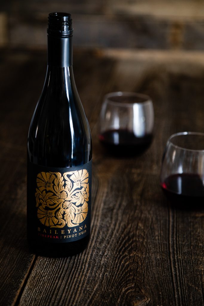
- Baileyana wines are classic cool-climate varietals that are described as refined, rich and balanced. The labels are a direct visualization of the strong, beautiful taste the wines are known for.
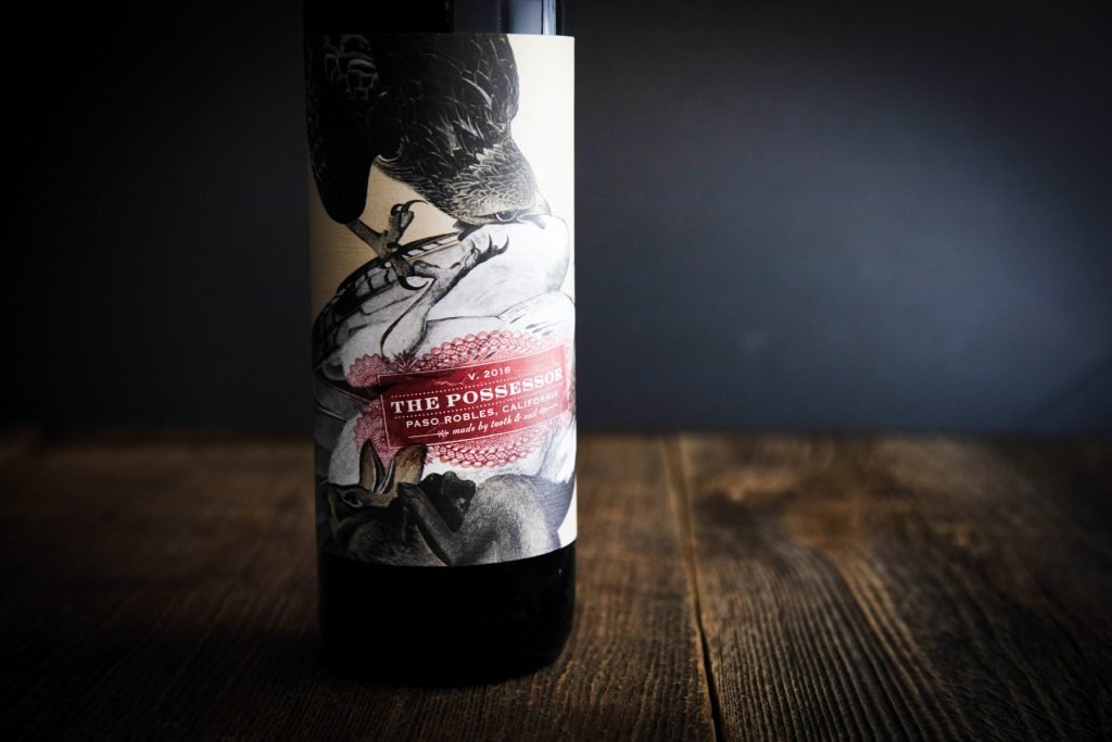
– “We wanted to create a relatable brand that showcases nature’s fight for survival, while highlighting the notion of pressing adversity. The Tooth & Nail labels are renditions of John James Audubon’s drawings of beasts of the early 1830s, fighting ’tooth and nail’ to survive. Here, Audubon depicts two red-tailed hawks fighting to become the sole POSSESSSOR. People can probably relate to this battle we’ve been enduring with COVID-19 and the need and desire to press on.” —Rob Murray, Owner, Rabble Wine Company in Paso Robles
– The label is bold, unconventional and unapologetic, just like the wine which is a cabernet-dominant red blend. The label is full wrap and is embossed and debossed to give texture and substance.
– Fun fact: The Rabble range consists of nine labels that are woodblock prints from the 14th century Nuremberg Chronicles. Four of the wines have augmented reality featured within their label. Anyone can download the Rabble wine app, put their camera over the label and watch it come to life.
