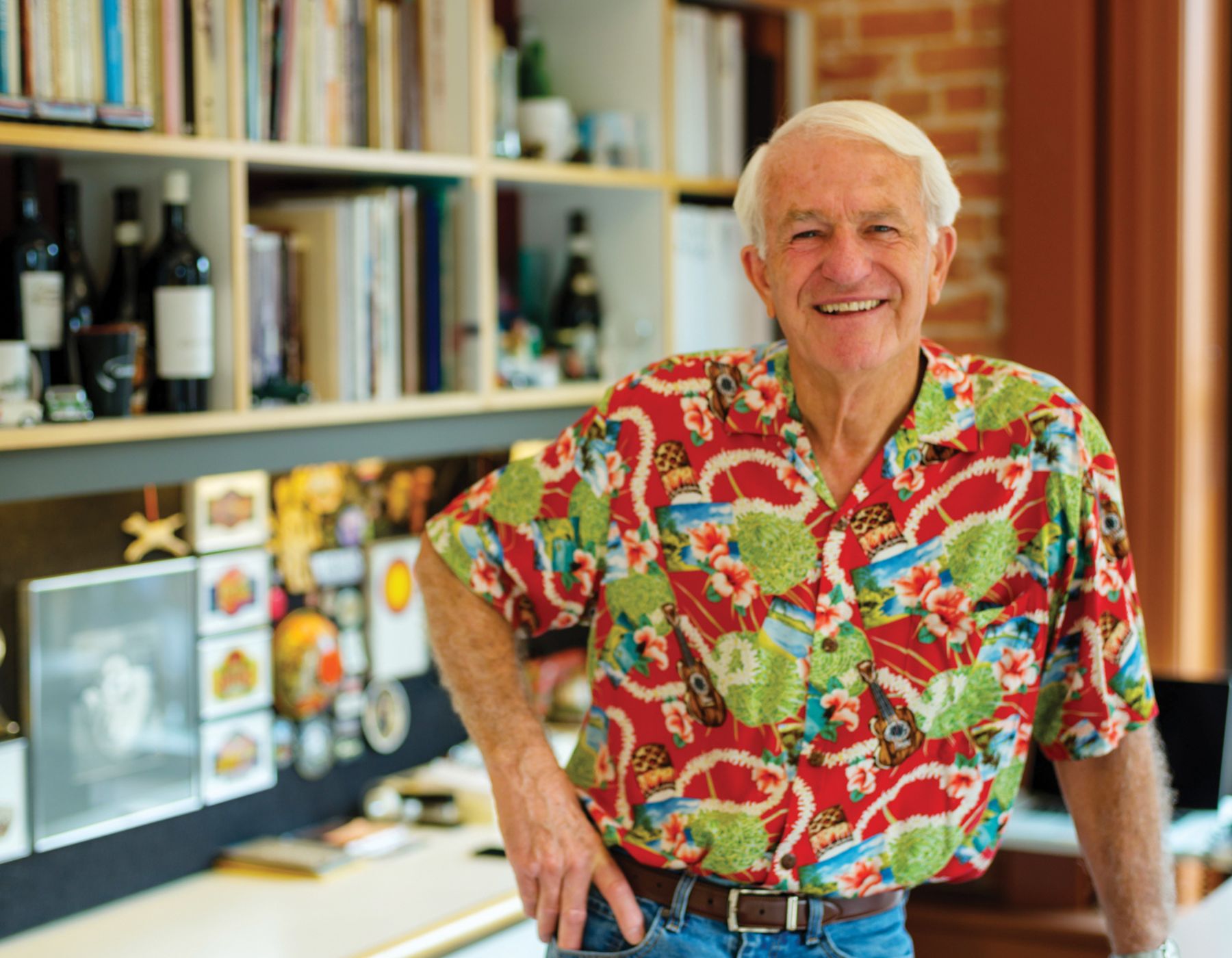
A “Maker” of Designs With Impact
Story by Molly O’Brien
Photography by Stephen Heraldo
Logos are a key part of a business’ identity, the stamp that distinguishes one brand from another. Studies show it takes just 400 milliseconds for the brain to recognize a logo and trigger a response based on personal preferences and previous experiences with the brand. A logo can elicit responses of happiness, comfort, hunger and even safety. And for more than three decades, one San Luis Obispo resident has been integral to evoking these feelings through design for business owners in the local community and beyond.
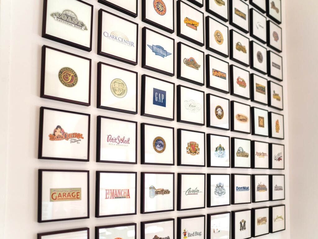
Pierre Rademaker Design has long offered creative and consulting services to a wide range of clients from national brands like GAP, having designed its iconic blue square logo, to local fixtures such as Madonna Inn, Apple Farm, the City of San Luis Obispo and more. Pierre and his team design logos that go beyond a simple symbol — they create a first and lasting impression among consumers. In a technology driven world, Pierre and his team still begin a majority of their design work with a rough pencil sketch that’s later refined into the final product that we see on our morning commutes, dinner menus and even clothing labels.
Pierre grew up near Los Angeles in Torrance and studied art at California State University, Long Beach, where he concentrated on graphic design. He says he’s always been an artist, starting at a young age when he began drawing the moment he could pick up a pencil. “As a child, I always knew that I would be some kind of an artist eventually, career-wise,” says Pierre.
His official career in art began in Orange County as an assistant art director at an advertising agency. He used this time to learn about marketing, strategy and branding tactics. When a friend saw an ad in the Los Angeles Times seeking someone to assist in founding Cal Poly’s graphic arts department, he said it was a no-brainer to pursue his true passion of design and relocate to the Central Coast. “We had been to San Luis Obispo once prior to that and thought, ‘That’s a nice town, I’d like to see if I can live there, someday!’” he recalls. And he’s been a major part of the San Luis Obispo community since.
While teaching at Cal Poly, Pierre made the impossibly long commute to Syracuse to complete his graduate degree and earn his MFA. The entire time he was teaching, Pierre was also freelancing design work, traveling across the country and working with clients near and far. “I was traveling a lot, and doing a lot of production management,” he says. Eventually, overcome by the amount of freelance work he’d acquired, Pierre had to make a difficult decision about his teaching career. The dean instructed Pierre to take a leave of absence and try design for a full year. At the end of that year, Pierre’s client list had grown substantially and the travel demands of his graphic design work made it impossible for him to maintain a traditional academic schedule. In the late 1980s, he made the difficult decision to leave his teaching position. “It was a big decision, but I’ve been running my own office ever since, and doing the occasional teaching job, one class a quarter. I’m on multiple committees at the university, so I’ve [always] had a good relationship with them.”

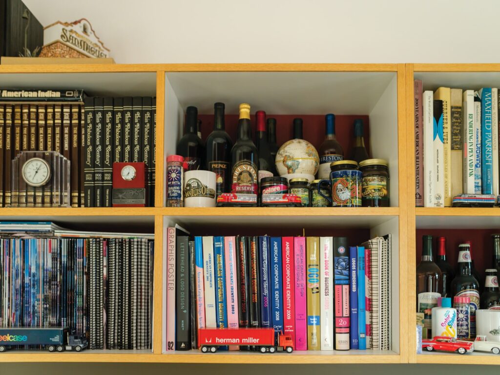
Over the years, he and his team have worked on at least 600 logos for a diverse range of clients. Pierre’s work can be found practically everywhere around downtown San Luis Obispo, across the county and beyond. This includes the historical marker signs around San Luis Obispo, which Pierre created for free since he lives in a historic district and wanted to make an impactful contribution to his home. “We’ve worked with Meathead Movers, the Cal Poly University seal, we’ve done Giussepe’s downtown logo signs, [worked with] the Chamber of Commerce, designed the City of San Luis Obispo town entry sign including the structure up on Highland, and the wayfinding system you see all over town, [and] the Pismo Beach letters over by the pier.”
Whether it’s the family crest and bold pink M of the Madonna Inn logo, the rustic cursive font that defines Giussepe’s or the historic Spanish mission of the City of San Luis Obispo, each element is carefully selected for the emotion it evokes and the brand association. What’s even more incredible is how all of his team’s incoming work has been secured via personal connections, and word-of-mouth recommendations. “All of our work is by referral — we don’t advertise and we don’t do any cold calling or anything like that. I know almost everybody here in Greater SLO — I’m very involved in the community, so I get a call when people need things.”
From consultation services to design and printing, Pierre and his small team of designers take a lot of pride and responsibility in the products they create, especially for businesses in their home city. “San Luis Obispo really is a remarkable place, and the people are just wonderful,” he says. “Everybody seems to know everybody. It’s a lot of fun, and I love knowing [these] people.”